Madhubani; Tradition Takes Flight
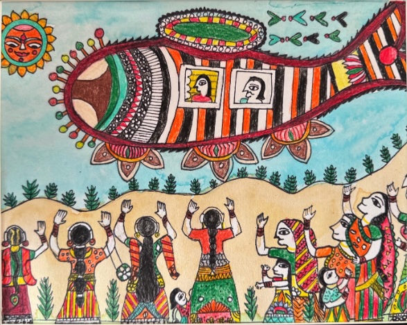
By: Pragna Gowdra Grade 8, Kalaa Studio A Journey Through Art: The Flying Fish of Imagination Created at Kalaa Studio, this artwork feels like a glimpse into a magical world, where tradition and fantasy come together. At the heart of the piece is a giant, flying fish-shaped vehicle, soaring through the sky with two people peering out from its windows. The fish is decorated with bright stripes and intricate patterns, outlined in bold black lines that make every detail pop. The vibrant colors—orange, green, and yellow—bring the scene to life, bursting with energy and excitement. Inspired by Madhubani art, a traditional Indian folk style known for its flat, colorful designs and natural plant-based dyes, this piece captures the essence of cultural storytelling. There’s no shading, just bold, two-dimensional patterns, much like illustrations in a book. For me, this artwork is about adventure and imagination. In Madhubani art, fish symbolize good luck and life, but here, the fish flies, representing the thrill of exploring new places. Below, a group of villagers dressed in traditional Indian attire stand with their hands raised—perhaps waving goodbye or cheering with excitement. A smiling sun with a human face watches over them, adding warmth and connection to the scene. This piece tells a story of a village coming together, either to send off loved ones or to share a message with their leaders. It blends heritage with fantasy, showing that even the most traditional stories can take flight in new and unexpected ways. #ArtAtKalaaStudio #MadhubaniArt #FlyingFish #FolkArtMagic #ImaginationInArt #KalaArtAndDesign
Happiness is… Having Hot Pot
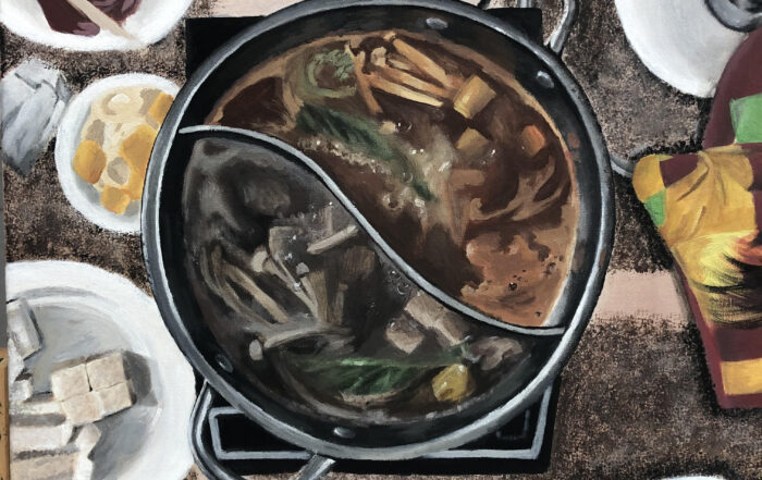
By- Vivian Gao, Senior 2023 Food has always brought people together, and my family is no exception. Family meals provide an opportunity for family members to come together, strengthen ties and build better relationships. In our busy lives being together with family for food is really important, as old tradition used to be. In my acrylic painting, the composition is centered around the pot, reflective of how it brings my family together and gives us a chance to take a moment from our busy lives to enjoy each other’s company. Hot pot is a well-known Chinese dish, and we eat it for special occasions and holidays; it’s our version of a Thanksgiving turkey. For this painting, I have used the acrylic painting technique of layering. The beauty of acrylic paint is that it dries fairly fast (unlike oil paint). This means that you can paint a layer of acrylic on the canvas, wait for it to dry, then paint another layer over top. This method gave depth and richness to my detailed food painting. The project was Still life with a combination of observational drawings. For this I prepare the meal laid the table and planned my artwork. I’m so happy with the outcome. Instances like this become memories I recall fondly, and paintings like this show my appreciation for the opportunities I have to spend time with the people I love. I hope the viewer is filled with warmth or a newfound appreciation for the little moments in their life.
Radha-Krishna: The Colors of Divinity
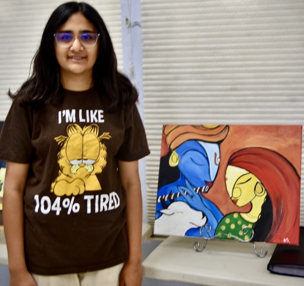
By- Anika Shiroor, 8th Grade During this past summer holiday, our art school was deciding projects for all of us. I was given a watercolor landscape village project by Ms Nidhi and it did not excite me since I had drawn landscape scenes multiple times before. So I asked her if I could do a canvas painting instead and she agreed on the condition that I pick a subject related to my culture. I decided to go with the Radha Krishna theme from among the many options she gave me. I thought it was the prettiest of the lot. For this artwork, I first drew out a sketch to my liking. I altered the original piece as per my artistic vision. I discussed this with Ms Nidhi and then changed the skintone to blue and yellow to show that it was Krishna and Radha. Colour plays a significant role in art, and it holds even deeper meanings in the context of Hindu spiritual and cultural depictions. Traditionally Krishna is depicted in blue, The Color of Divinity. Blue Color distinguishes God from mere humans. the colour blue carries profound symbolic meaning. It is associated with divinity, transcendence, and the infinite. It represents the vastness of the sky, the depths of the ocean, and the boundless expanse of the universe and at the same time depicts calmness, serenity, and tranquillity. Radha is supposed to be very fair in comparison so I changed Radha’s skin color to contrast Krishna’s. I have used acrylic paints in this painting. Yellow is often associated with sunshine, warmth, and the vibrant energy of life. Radha is symbol of It represents optimism, happiness, and radiance. To make it fit into the contemporary style with abstract elements, Ms Nidhi sugggested to make the eyes long and prominent. We decided to keep the eyes in the painting closed showing clamness. The calf was not in the original picture. I added a calf because in the traditional stories, Krishna is a cow herder and adding this to the painting made it complete. Since the design was too plain, we added decorations to the garment and flute. The background is a contrast to make the characters pop. It was a difficult piece because the surfaces had to be smooth with every brush stroke. It took me around a couple of classes to do it because I kept removing features with new ones. The final painting shows us Krishna playing the flute while Radha and the calf are listening and enjoying the tune that he is playing. Growing up, I have heard many stories of the iconic duo, Radha and Krishna. They are told to be the greatest of friends. She is his greatest companion in Vrindavan and their relationship symbolizes unconditional love. Growing up with these stories have had an effect on me. Therefore this painting means a lot to me.Exploring the symbolism of colours in Krishna paintings allowed me to appreciate the thoughtfulness and intention behind the portrayal of this divine figure. I am proud of this work and would like to make more paintings on this theme in different genres.
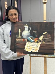
COVID Hang Back-2.5 years, One painting
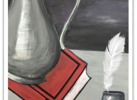
By Aditi Manchanda- 2022 This is the story of my journey with one painting over 2 years. When I first started this piece, I was in 7th grade. Once I found out we were doing a still-life concept, I excitedly drew out what I wanted to paint. A big silver jug on a book, some fruit, and a quill in an ink pot. I kept painting every week with the intention of displaying my painting at the next Kalaa Exhibition. Little did I know at the time, the exhibition was not even going to take place. One fateful day in In March 2020, the school closed. At the time, we were told it would only be for a week but the break never ended. A couple of weeks later, art classes were switched online. For the next two years, I sketched watercolor painting and tried a bunch of other fun crafts all through a screen. Eventually, I forgot about my painting that lay in the art studio, incomplete for two entire years. When I finally returned to the studio in 2022, I was ecstatic. At the time, my interests had shifted from art and painting to fashion design. I wanted to make my own clothes and accessories which is what I ended up doing for a couple of months. Then, my teacher showedme my painting from when I was in middle school and I was bewildered at my choices. I was nothappy with what my 12-year-old self had picked. I found my selection amusing, my techniques were less refined than now, nevertheless completed a few left-out strokes and finished the work as I always feel the completion of the task is equally important With time, not only had my skills improved but have varied dimensions in the creative arena I thought completing it as quitting on anything is not the right choice to make. It was a selection right for a 12-year-old me and it was interesting to, let me finish that incomplete task which unfortunately COVID has taken away from all of us. In the end, I decided to stick with my painting as a reminder of how much growing up changed me.
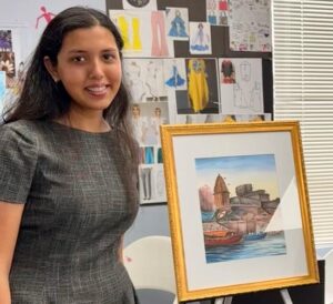
My Tween Brush Strokes-The Golden Gate Bridge
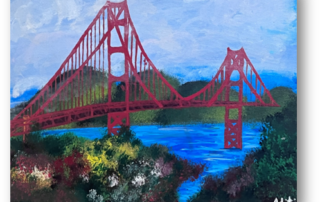
By- Aditi Manchanda, Sophomore 2022 This painting is of the Golden Gate Bridge and is one of my oldest paintings. I made it when I was in 6th grade. It has so many memories associated with it that I thought to document them in my art blog; “Better late than never :)’I don’t remember much of that time but I do remember the many skills I learned from this painting. It was the basis for all the paintings I have made since then. I learned many valuable painting techniques such as how to use shading in an image to make something look 3d, dabbing the paintbrush to make flowers and bushes, how to paint water realistically, and how to make clouds. These are skills that I have used in several of my paintings since then and have improved at. I really enjoyed making this painting and I put a lot of hard work into it. I also want to talk about the significance of this painting. Living in the bay area has given me the luxury of visiting the Golden Gate Bridge. So many of my favorite memories were made there, hiking, walking across the bridge, visiting Golden Gate Beach, and Golden Gate Park. I have been there so many times with so many different family members and friends that sometimes I forget that people travel from all over the world just to see it. It is a beauty that I take for granted and it attracts over 10 million people a year from all over the world. I never really processed that I lived near a historical world-famous landmark. This painting is a reminder of all the fun times I have had in my life with the people I love but more importantly, it is a reminder to never take things for granted.